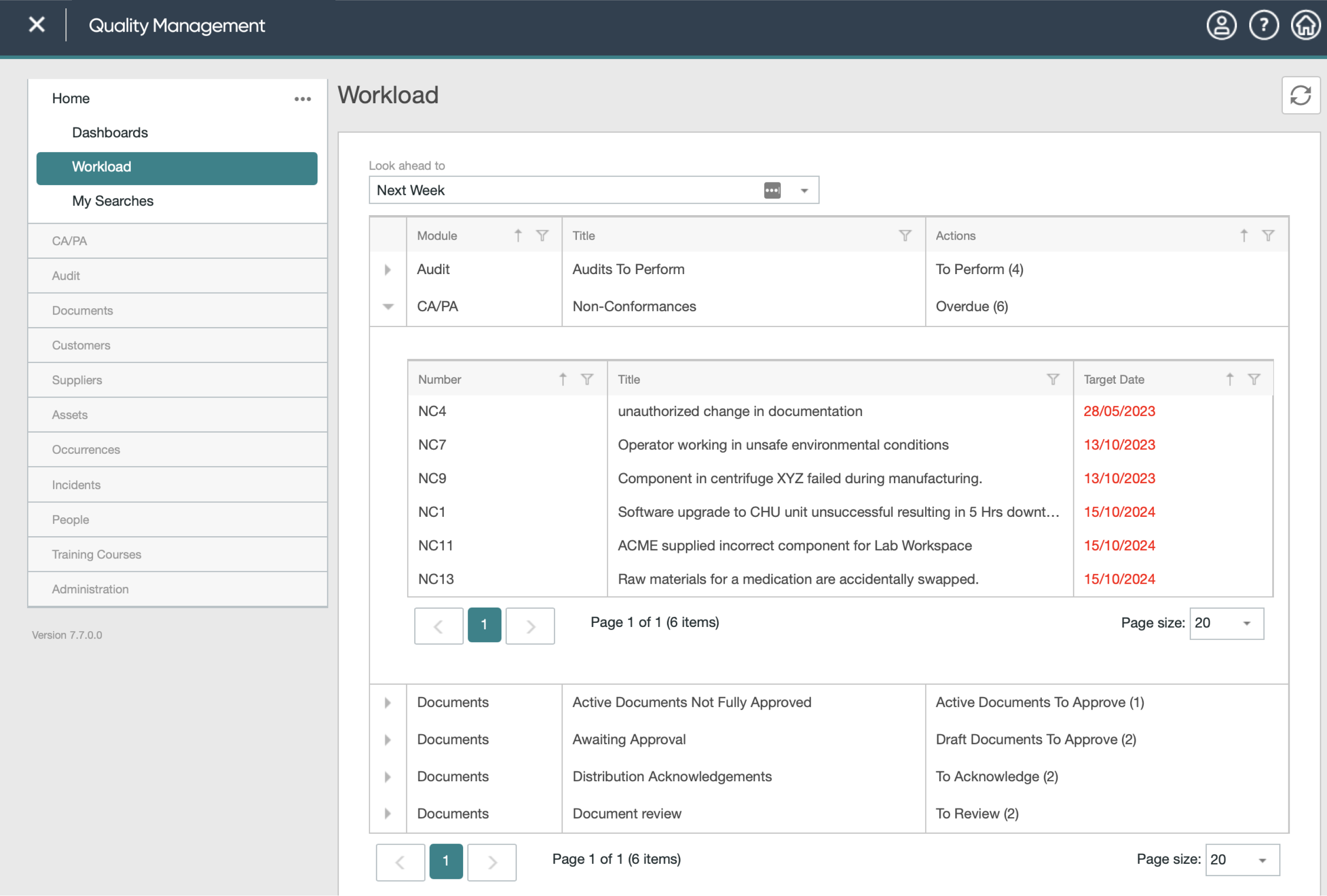
PROBLEM
People struggled to find urgent work, understand nested task information and complete routine actions without losing context. Missed and overdue tasks created a genuine compliance risk.

MAKING REQUIRED ACTIONS EASIER TO FIND, UNDERSTAND AND COMPLETE
A redesign of in-system task management for an aviation and engineering-focused quality management platform. The work brought workload discovery, filtering and common actions into one coherent experience while aligning the product with the company’s standardised UI platform.
People struggled to find urgent work, understand nested task information and complete routine actions without losing context. Missed and overdue tasks created a genuine compliance risk.
I led discovery and the proposed redesign, combining NPS and support themes, user questionnaires and a heuristic review with journey mapping and interactive prototypes.
The work established one reusable workload model with visible search and filtering, contextual quick actions and accessible standardised UI patterns. Post-release metrics were not available.
As Senior UX Designer, I owned the experience from problem definition through to the proposed redesign. I brought together NPS feedback, questionnaires, support themes and a heuristic review; mapped the core workload journeys; and designed and prototyped the new search, filtering and quick-action patterns. I worked with product and engineering to align the proposal with the shared UI platform and the constraints of the existing quality management product.
Quality managers work across several processes at once. They need to spot what is urgent, understand what is expected and act with confidence, often without having time to relearn the interface for every task type.
Falling NPS scores, poor user questionnaire feedback and an ever-growing list of support tickets showed that, as a whole, our users were not satisfied with the current system. For most users, the Workload screen forms the bread and butter of the platform and is the place where they spend the most time interacting with the system.
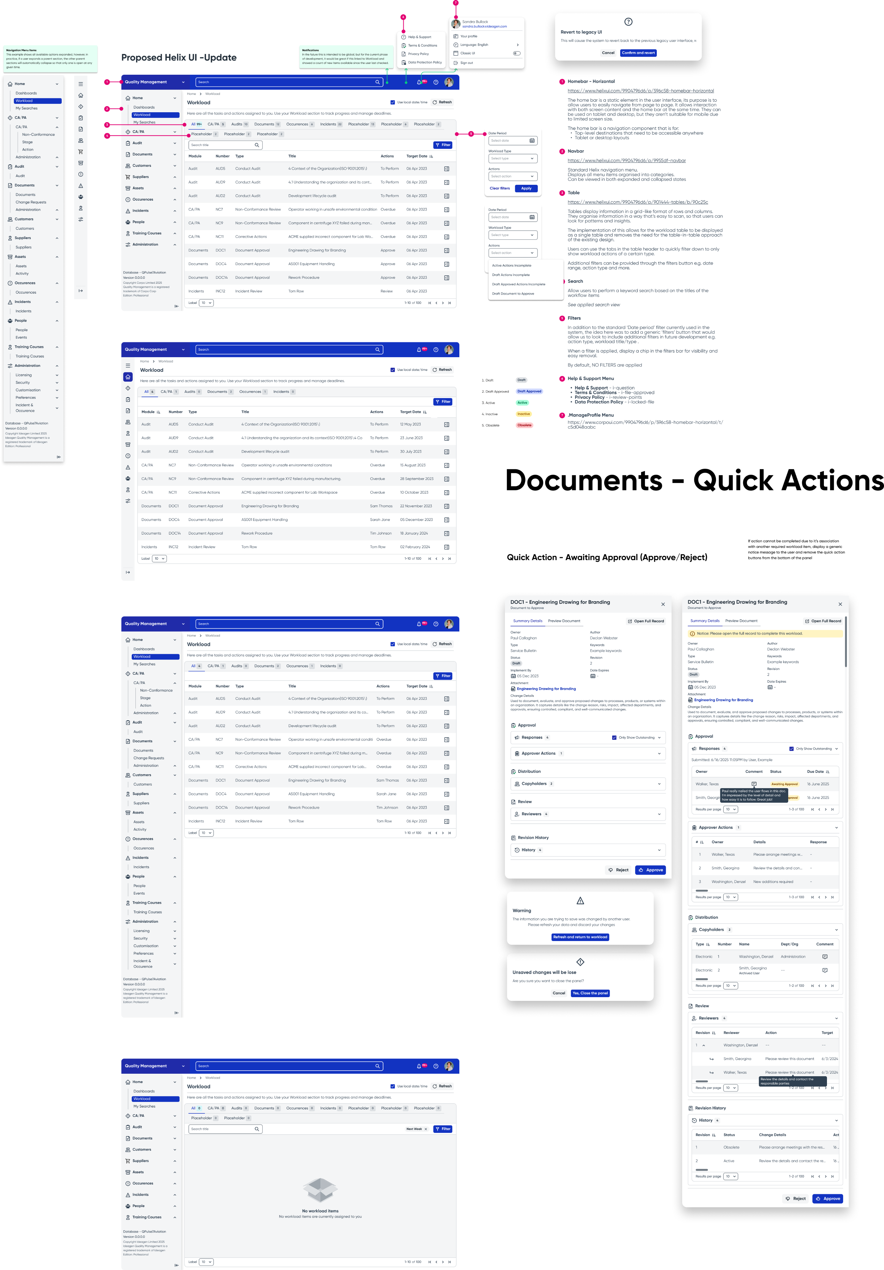
The redesign keeps the operational detail but changes how it is organised. Categories, controls and status information now follow the shared product language, making the page easier to scan before a user opens anything.
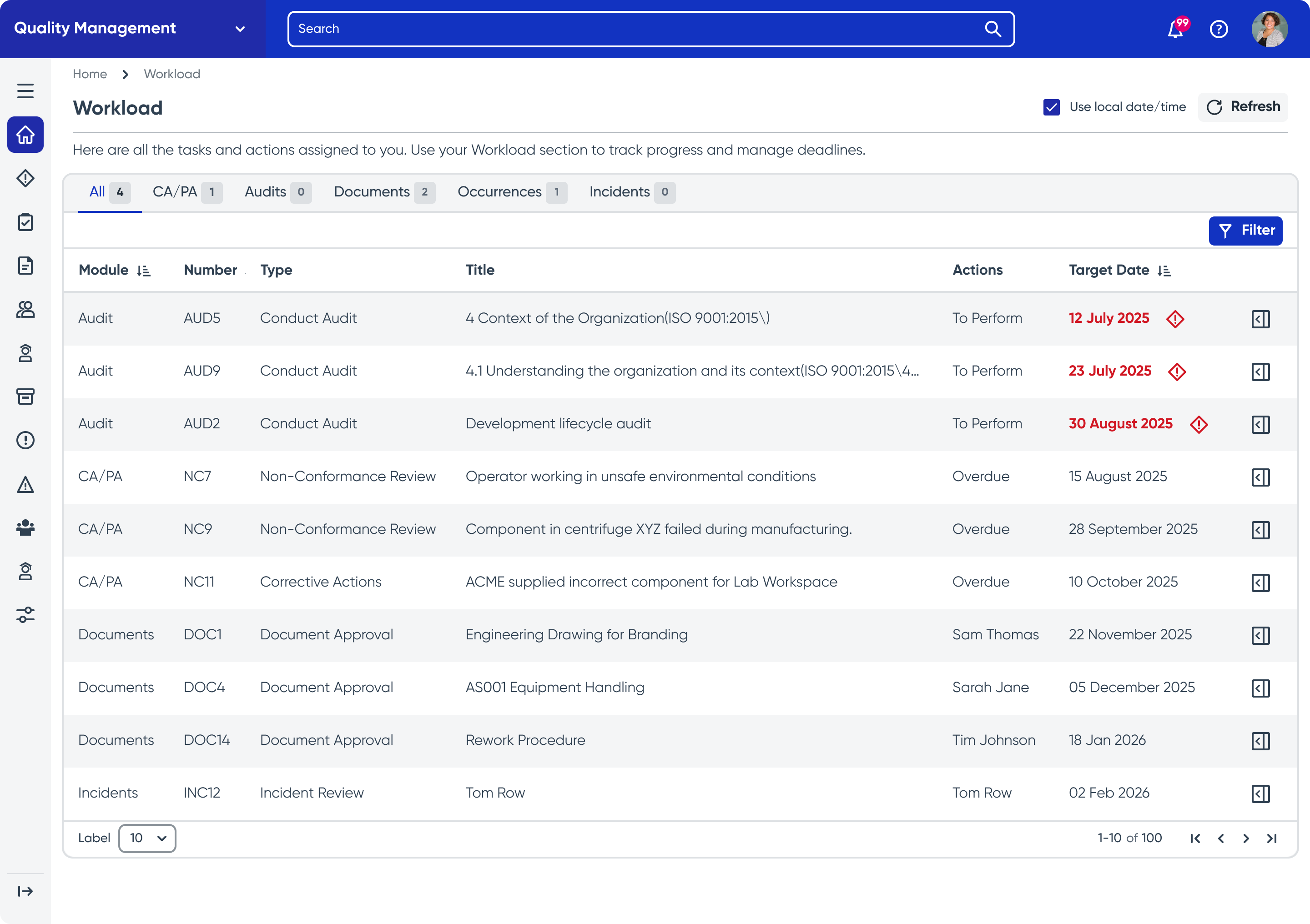 ORIGINALNEW
The design exploration started with the current workload and the repeated task patterns already present across the product. This kept the focus on real points of friction and identified where one shared interaction could replace several slightly different ones.
An NPS Data & Feedback Review analyzes customer satisfaction scores and open-ended responses to uncover recurring themes, pain points, and opportunities. By segmenting users into Promoters, Passives, and Detractors, it quantifies sentiment, prioritizes improvements, validates design decisions, and aligns stakeholders around a shared, data-driven understanding of the user experience.
Carried out a heuristic UX review to evaluate the interface against established usability principles to uncover friction points, inconsistencies, and accessibility gaps.
Distributed user questionnaires in-system via Gainsight to users across all experience levels, gathering quantitative and qualitative feedback on workflows, pain points, and feature satisfaction to inform design decisions.
Our NPS scores were in the negative, user comments included repeated references to the system being ‘dated’, ‘clunky’ and ‘inefficient’ and our own internal reviews of the system backed up these challenges.
The direction was validated by triangulating three sources rather than relying on a single signal: negative NPS and written feedback, questionnaires from users across experience levels, and the heuristic review of the live product. We then checked the redesign against the recurring workload journeys these sources exposed, including finding overdue work, understanding nested information and completing an action without losing context.
The proposal created a consistent route from finding work to completing it. The workload became the shared starting point, filtering stayed visible and common actions moved into focused side panels that preserved the user’s place.
The design produced one coherent workload model in place of several disconnected interaction patterns. It made search and filtering visible, brought common actions into contextual side panels, addressed known contrast issues through the standardised UI and preserved the operational detail users needed to act confidently. This case study records the design outcome; post-release performance metrics were not available for this phase of the work.
Task management works best as a product-wide model, not a collection of module-specific shortcuts. Reusing workload, filtering and action patterns reduces what users need to learn.
Speed matters, but context matters more. The strongest improvements removed navigation while keeping the information and safeguards needed to make a confident decision.
Empty states, warnings and confirmations are part of the task flow. Treating them as designed moments makes the system easier to trust when the work is regulated.